Filipino Christmas Giant Lantern Festival


Christmas trees to the West, are what giant lanterns to the Phillippines.  In this blog post, I will walk you through the Giant Lantern Festival (or Ligligan Parul, as it’s known in the Philippines) as we learn together just how important these lanterns are to this small country.  There is a huge annual festival held in the city of San Fernando, Phillippines in mid-December.  The fascination and popularity of this event have now deemed San Fernando the “Christmas Capital of the Philippines”.  There is some speculation about the exact date of when this tradition started, but it has been dated back to 1904 as potentially the very first festive parade of lanterns.  Light, in which the lanterns represent, is a sign of hope for the heavily Christian populated country.

The original lanterns were only about two feet tall and made from bamboo and other natural locally found materials.  They were constructed by patrons of the church and community and were used in the celebration of the 9 days before Christmas.  They were paraded down the street and all convened at church for midnight mass on Christmas Eve.

In 1931, electricity was established in the city of San Fernando.  This was an exciting time for the people of the Philippines and was the start of bigger, electric lanterns being conceptualized and created by entire neighborhoods.  Families, friends, and neighbors work together to create huge (around 15 feet) lanterns that are displayed in the now, Giant Lantern Festival.  This unified these small neighborhoods.  As they marched their lanterns down the streets, they used switches to turn on and off the lantern to the beat of the music.

Today, these lanterns are made out of all sorts of materials, colored plastics are replaced with fiberglass and handmade papers.  Fiberoptics and the use of rotors (large steel bars that can help manipulate the lighting) replaced the need for turning the lanterns on and off with a switch.  Steel is welded and you rarely see the traditional materials being used.  Lanterns consist of 3500-5000 light bulbs in each one.  Even though the materials and size have changed with these lanterns over the years, the message of hope has remained the theme of this festive procession.

The art elements displayed in these lanterns are just as unique and individualized as each lantern itself.  There are definitely some super clean, straight lines being used.  The colors are vibrant and bright.  Shadows are then created between the welded lines of steel, and the iridescent colored materials with the lights illuminating from behind. The shapes are done in many forms. Some are circular, some are shaped like diamonds.  So many art elements to appreciate these lanterns.  The smooth textures allow the light to shine through and lead them to the town center for mass.  I had never heard about this festival before.  I wanted to bring “light” to it after I had seen so many awesome examples of the lanterns.  Christmas is my favorite time of the year, and it was super interesting learning about how another culture celebrates it.

Works Cited

“Giant Lantern Festival.” Wikipedia, Wikimedia Foundation, 26 Nov. 2018, en.wikipedia.org/wiki/Giant_Lantern_Festival.

Management Information Technology Division. “Giant Lantern Festival at The City of San Fernando.” City of San Fernando – Christmas Capital of the Philippines, cityofsanfernando.gov.ph/forvisitors.

“Giant Lantern Festival 2018.” Pawikan Conservation Center – DiscoverPhilippines.com, www.discoverphilippines.com/events/giant-lantern-festival-2018.

American Animation During War World ll

donaldnazi

The Golden Age of American Animation

The Golden Age of American Animation was from 1928-1972.   This was an exciting time for entertainment.  Here we move out of the silent era of cartoons and animation and move into a much more interactive experience.  Many childhood favorites were born during this time to the likes of Porky Pig, Casper the Friendly Ghost, Betty Boop, Daffy Duck, and so many others that we grew up with.  This was also the time that long, full-length animation came to life on the big screen.  Even though this era began in the early modern age of art, I wanted to connect with the later years of this Golden Age of American Animation and what it looked like during War World ll.  The sound in animation steered Americans away from their radios, and into the world of television.  From the use of orchestras to characters having the ability to speak, animation opened up an entirely new, and an entertaining can of worms. We are now open to many different genres of art. Sketching, movie making, directing, producing…so many new ways to creatively express yourself as an artist emerged during this time.  In this blog, we will look at some famous directors and producers that evoked patriotism during War World ll.

Animation during this time was used for company training, military training, and for political campaigning.  Movies like Fifth Column Mouse, Chicken Little, Der Feurer’s Face, and Victory Through Air Power all played important propaganda roles during this era. Animation was also a non-threatening way that the government found to use as propaganda for the war. Bugs Bunny Bond Rally is a cartoon that  Americans could see Bugs Bunny dancing and singing about war bonds.  Many characters during this time were depicted doing their part.  Scrap Happy Daffy was a short film depicting Daffy Duck donating scrap metal for the war effort.  Out of the Frying Pan Into the Firing Line is a short movie where Pluto and Minnie Mouse are encouraging Americans to recycle their kitchen grease so the government could make it into explosives.  Donald Duck does his part in reminding citizens of the importance of paying their taxes during wartime in Spirit of ’43. 

Walt Disney

220px-Der_Fuehrer's_Face_poster      MV5BMTY0NTE4MzI2NF5BMl5BanBnXkFtZTcwMzU4MzcyNw@@._V1_SY1000_CR0,0,1322,1000_AL_

Produced by Walt Disney, Der Fuehrer’s Face was released in 1943.  This was one of many American animated anti-nazi propaganda shorts created during War World ll.   This is the original theatrical poster produced to advertise the short film.  It was shown in movie theaters as a means to sell war bonds.  It is an 8-minute movie and created with Technicolor.  There was a large animation team for this project because, during this time, it was such a large process to create an animated film.   It began with creating claymations that were studied by the artists for movement and lifelike characteristics, to then in-turn sketch each scene, and lay them into cells, and then into a film.  Elements like shading, movement, and even the texture really makes these pieces come to life in an animated way.

This second picture is another short produced by Walt Disney.  It’s titled Donald’s Decision.  It was released in 1942 and ran for 3 minutes and 35 seconds.  The color process was also Technicolor.  This film was actually released first in Canada.   The Canadian government was also urging their citizens to purchase war bonds in support of the war.  Disney felt a huge financial impact from the war.  With the loss of the European market, due to the war, Disney had to be creative and reach out to other markets.  I love how simple the use of shadow is in this frame.  It was thoughtfully done.  The multiple uses of color and tone are impactful, drawing the audience the gold-haloed duck with the piggy bank (Donald’s conscience).  The amount of three-dimensional work is apparent and appreciated throughout the short.

Bob Clampett

hqdefault    MV5BODkyZTFjYWUtYTVhOS00Njk0LWIxN2ItNGQzYzYzMTAzMDcyL2ltYWdlL2ltYWdlXkEyXkFqcGdeQXVyNjYyODY4NDU@._V1_

Any Bonds Today is a short film directed by Bob Clampett.  It starred Warner Brother’s Bugs Bunny and other favorites, but oddly enough, not considered a Looney Tunes or Merrie Melodies production.  Just a spin-off of them.   The song was written by Irving Berlin and this was used as a propaganda piece in War World ll (1942) for Americans to purchase war bonds.  This was a 90-second film short (what we would now call commercials) and started as a sketch, then processed onto cells, then film.  It debuted 8 days after the attack on Pearl Harbor and was done at no charge as an act of patriotism.  This type of propaganda was played in movie theaters.  Ushers would collect money for the war efforts throughout the movie.  Here you get to see some solid three-dimensional sketch work.  The contrast between the main characters in the front from the gloomy, war-torn background is very apparent.  The exaggeration used in the faces really allows for some personality to come out in an animated way. What a fun time in history for animation!

Draftee Daffy was a 7-minute cartoon in which he is feeling very patriotic and gets a call from the draft office stating they have a letter for him.  As the clip unfolds, so does the excitement of going to war.  Daffey then is doing what he can to avoid the delivery of the draft letter.  It was fun to watch and can be found here.  The release date for this cartoon was 1945.  It was directed by Bob Clampett.  It was produced in technicolor and is part of a collection that was later released in 1989 titled Bugs and Daffy: The Wartime Cartoons.  There were so many fabulous cartoons about patriotism and War World ll directed by Bob Clampett during this time.  It was really interesting to see the connection between art and war in an animated manner vs. canvas or architecture.  I love the contrast between the to pieces here.  In just a matter of 3 years, color and animation had come a very long way.  So many more elements are introduced here with different shades, lines, and contrast.

Friz Freleng

Fifthcolumnmouse-2 t_500x300\

The Fifth-Column Mouse was directed by Friz Freleng.  This is a 7-minute movie created in Technicolor.  It was released in 1943.  It was about a group of mice that are banding together against a cat that was threatening their way of life.  A mouse gets captured and the cat convinces him that he won’t hurt any of the other mice and encourages him to go tell the others of his promise.  This was part of the “loose lips sink ships” propaganda used by all sides relying on that the people would believe “fake news” to help with their war tactics.  It was created in reference to War World ll.  The cat is the Axis, and the mice the Allies.  American directors and producers found many different ways to reach their target audiences in these propaganda pieces.  Shadow, shading, and even the tone really bring life to this cell.  All eyes are drawn to the main character.

Private SNAFU (U.S. Army acronym standing for Situation Normal: All Fucked Up), was a short film (4 minutes), directed by Friz Freleng between 1943-1946.  Pvt. SNAFU was used as a training movie for incoming military members.  Pvt. SNAFU did everything that a soldier should never do.  He had loose lips, and would often tell about troop movement.  Again, using animation to meet your target audience, many of the younger recruits were illiterate, and this was a way to show them what not to do as well as build literacy skills.  Pvt. SNAFU cartoons were at one point a military secret and only used for training. They were considered classified government documents.  Another fabulous use of three-dimensional art.  The use of line and shading really creates a realistic animated character.


Works Cited

“World War II and American Animation.” Wikipedia, Wikimedia Foundation, 17 June 2018, en.wikipedia.org/wiki/World_War_II_and_American_animation?scrlybrkr=201a02e4.

“Der Fuehrer’s Face.” Wikipedia, Wikimedia Foundation, 8 Oct. 2018, en.wikipedia.org/wiki/Der_Fuehrer%27s_Face.

“Donald’s Decision.” IMDb, IMDb.com, www.imdb.com/title/tt0167901/mediaviewer/rm4211191808.

“Donald’s Decision.” Wikipedia, Wikimedia Foundation, 6 Nov. 2018, en.wikipedia.org/wiki/Donald%27s_Decision.

Storozynski, Alex. “FROM WARNER BROTHERS… Bugs Bunny CHAPTER 137.” Nydailynews.com, New York Daily News, 9 Aug. 2002, www.nydailynews.com/archives/news/warner-brothers-bugs-bunny-chapter-137-article-1.505422.

 “Old Banned Bugs Bunny U.S War Bonds Commercial from World War 2.” YouTube, YouTube, 16 Apr. 2009, www.youtube.com/watch?v=a1Scr3TLcm4.

“Any Bonds Today?” Wikipedia, Wikimedia Foundation, 1 Oct. 2018, en.wikipedia.org/wiki/Any_Bonds_Today%3F?scrlybrkr=201a02e4.

“Draftee Daffy.” IMDb, IMDb.com, www.imdb.com/title/tt0037659/mediaviewer/rm1301166592.

“Draftee Daffy.” Wikipedia, Wikimedia Foundation, 27 Aug. 2018, en.wikipedia.org/wiki/Draftee_Daffy?scrlybrkr=201a02e4.

“File:Fifthcolumnmouse.jpg.” Wikipedia, Wikimedia Foundation, 19 Apr. 2018, en.wikipedia.org/wiki/The_Fifth-Column_Mouse#/media/File:Fifthcolumnmouse.jpg.

“Private Snafu.” Wikipedia, Wikimedia Foundation, 24 Oct. 2018, en.wikipedia.org/wiki/Private_Snafu.

“This WWII Cartoon Taught Soldiers How to Avoid Certain Death.” History.com, A&E Television Networks, www.history.com/news/wwii-propaganda-private-snafu-flashback.


World War One Influences in Early Modern Art

24TH East Surrey Division

images


101391503-38049-800

This is a gorgeous war memorial created by Eric Kennington (1888-1960). This piece comfortably sits in Battersea Park, London.  This was the first publicly commissioned piece of art of Kennington and was created in 1924. This sculpture pays tribute to the men of the 24th Division British Infantry until serving on the front lines of the first World War.  Kennington himself had experienced fighting in two different regiments.  He became a war artist, and he actually purchased the Portland stone (a form of limestone) himself.  It sits 6 feet 6 inches tall and in the shape of a cylinder.  It continues the cylinder pattern by being surrounded by a cylinder hedge.  It is a free-standing sculpture and eloquently depicts three soldiers standing together with a serpent at their feet.  I love memorials.  I am fr

Storm Troopers Advancing Under Gas

war301.jpg

This powerful piece was etched on paper with ink by expressionist German war artist, Otto Dix in 1924.  Its German title is “Sturmtruppe Geht Unter Gas Vor”.  It was one of many in a series that Dix named “War”.  This collection included graphic pictures of what Dix witnessed during his time on the ground in WW1.  Dix was very dark and part of a radical expressionist group bringing light to the grotesqueness and the urban decay that was a byproduct of WW1.  Propaganda was huge during this time, and Dix had the power of art to help get out his anti-Nazi message out to the world.  This picture was shocking and scary.  I couldn’t get the image out of my mind.  I actually had no plan to use this piece because it was so evil looking.  But it was impactful.  There is so much movement in this still picture.  I can feel them running right at me.  The contrast and shading make the subjects stand out from the simple, dreary background.  I definitely would not keep this work in my house, but it is an important piece of history and should be shown in museums.

I Want You!

uncle-sam

This iconic U.S. propaganda poster was made with a lithograph by American artist, James Montgomery Flagg in 1916.  It was part of a heavy Army recruitment campaign during War World One.  Patriotic colors, with a stern, finger in your face Uncle Sam, really gets the point across that there was a need to fill during the war.  Flagg modeled himself for this picture with a mirror.  He used a similar poster from Britain from two years prior.  Over four million copies were printed and seen all over America.  I chose this piece because of the emotion it evokes in me.  I feel most Americans can appreciate this iconic piece of patriotism.  The placement of the authoritative “Uncle Sam” is centered in the middle of the page, drawing your eyes to his.  Who could say no? The use of line and the stark contrast from the navy and red against the white really adds a simplicity to this piece.  I would definitely own this piece and hang it with pride in my home, school, and I think with the emotion it evokes, should be seen more often than it is now.

Works Cited

“24TH EAST SURREY DIVISION.” War Memorials Online, www.warmemorialsonline.org.uk/memorial/111249.

“24th East Surrey Division War Memorial.” Wikipedia, Wikimedia Foundation, 1 Aug. 2018, en.wikipedia.org/wiki/24th_East_Surrey_Division_War_Memorial.

“Stormtroopers Advancing Under Gas.” – Leicester’s German Expressionist Collection, www.germanexpressionismleicester.org/leicesters-collection/artists-and-artworks/otto-dix/stormtroopers-advancing-under-gas/.

Dix, Otto. “Otto Dix Shock Troops Advance under Gas (Sturmtruppe Geht Unter Gas Vor) from The War (Der Krieg) (1924).” Lee Bontecou. Untitled. 1959 | MoMA, www.moma.org/collection/works/63260.

“‘I Want YOU!” – The Story Behind One of the Most Famous Wartime Posters in History.” MilitaryHistoryNow.com, 25 Oct. 2017, militaryhistorynow.com/2016/12/12/i-want-you-the-story-behind-one-of-the-most-famous-wartime-posters-in-history/.

Andrews, Travis M. “The Uncle Sam ‘I Want YOU’ Poster Is 100 Years Old. Almost Everything about It Was Borrowed.” The Washington Post, WP Company, 3 Apr. 2017, www.washingtonpost.com/news/morning-mix/wp/2017/04/03/the-uncle-sam-i-want-you-poster-is-100-years-old-almost-everything-about-it-was-borrowed/?noredirect=on&utm_term=.38467b39753a.

Romantic Era Style & Art Nouveau

In the time period between 1780-1850, a new era emerged.   Romanticism was more of an idea, a perspective, or one could even say an attitude in art, music, philosophy, poetry, and architecture.  Many people had their own idea about the definition of Romanticism, and rarely did their ideas match up with the next persons.  But even with so many having their opinions and thoughts on Romanticism, there was always a common theme within the definition-Expression.  The Romantic Era emerged from chaos and conversion.  The French Revolution being in its initial phase and the Industrial Revolution moving full steam ahead, it was a time of conflict and confidence.  Artists and people felt that they could conquer the world and create art how they wanted to, and conflict with more classically trained artists and philosophers not wanting to even recognize those Romantics as artists.  The result of this was having an eclectic grouping of art coming out of this period.

Art I Adore:

bor

This painting is called Aurora Borealis.  It was painted by Romantic artist Frederic Edwin Church. This artwork was created from two sketches.  One from Church himself, and one from a pupil of his.  This first piece is categorized as a Romantic composition. It was painted in 1865 and is a landscape composition painted on an oil canvas located in the Smithsonian in Washington, D.C.  Some say that this painting also suggested that because the Aurora is mostly only seen in the North, that it was evidence of God’s dissatisfaction of the way the South for supporting slavery.  It was said that it “alluded to this divine omen relating to the unresolved conflict” (Smithsonian American Art Museum: Commemorative Guide. Nashville, TN: Beckon Books, 2015).   During the Romantic Era, you see the bits and pieces of religion come back into play that may have been pushed to the side during the more classical compositions of the Classical Era. There are many great examples of luminism in this piece.  You can see the foggy, hazy air, without any direct lines, diffused light, and fabulous, natural tranquility throughout the picture.  Church was also a member of the Hudson River School, which this picture demonstrates what style of landscape paintings they were known for.  I was excited to see this piece as I, like most of us here in Alaska, look up at night, and when lady Aurora blesses us with her presence, it’s like the first time we’ve ever seen them every time. This painting was done well before advance photography was discovered.  The Aurora Borealis composition allowed for common people to see some spectacularly uncommon phenomena that they would have never before been able to see.

turner2

This is another composition created by English Romantic artist, JMW Turner.  It is called Fisherman at Sea and was painted in 1794.  This painting was also oil painted on canvas.  In this painting, we see a small boat in a powerful ocean.  This marine composition represents the intensity of nature, with the dark sky, created with soft brush strokes, and a very large contrast in light and dark and the simplicity of man, represented by a small, battered boat, toughing it out in the rough seas, with dangerous terrain surrounding them.  The moon is creeping through the clouds and is just as present as the light from the fisherman’s lantern.  Both playing an eager role in their representation of nature vs. man.   The ocean is so very large compared to the human aspect in this picture, it very much gives me a feeling of nature being valued over civilization when I look at the picture.  This picture creates a lot of emotion, anxiety the most prevalent.  Bringing an emotional aspect to paintings during this time was very common.  There is a lot of luminism used in this piece as well.  Again, you can see the diffused light and hazy brush strokes.  There is a peacefulness created amongst the chaos of nature in this picture.  The emotion it creates is the part I enjoy the most in this painting.  I find it interesting that this picture portrays more of a destructiveness and darkness, whereas from Neoclassical Era to the beginning of art, compositions were always representative of morality and the church, and a “bigger picture”.  Now get to see another side of art with more emphasis on nature, emotions, and the individual.

Art I Just Can’t Wrap My Head Around:

invaluable-art-nouveau-5b-Egon-Schiele-670x479

Reclining Woman With Green Stockings” -This is an example of Art Nouveau.  It is by Austrian artist Egon Schiele.  It was painted in 1917 and was also an oil painting on canvas.   I don’t like the way color or line is used in this piece. I think it is chaotic, and not in a good way.  The hard jawline and muscular appendages,  and muddy muted coloring is a huge turn off for me.  From what I’ve read, this piece was intended to be a sexy, provocative composition, it just feels wrong to look at.  Because it is not even sexy or beautiful.   It’s more like a train-wreck, that I don’t even want to look at.  It just doesn’t look like the more traditional art or even good art.  I can very much tell why that Art Nouveau was a short-lived style.  Schiele was transitioning from earlier works with straight lines, to more accurate, curvy lines that made his subjects look more like they do in this piece.  He is not only known for his use of twisted bodies and expressive lines in his work, but for bringing forth a new presentation of sexuality.  In fact,  Jane Kaller has commented on Schiele’s work as “being grotesque, erotic, pornographic, or disturbing, focusing on sex, death, and discovery.” (Harry Abrams).  And it makes total sense.  This movement was to move away from artists being told how to do their art.  They took this as an opportunity to express themselves exactly how they’d like without fear of consequences for doing so.

Riga_Jugendstil-Ornament_Art_Nouveau

Riga, Europe, is home a sizable exhibit of Art Nouveau architecture.  Many pieces just like this one adorn the streets of Riga.  I don’t like them.  They are odd to me.  The art doesn’t make sense to me.  I can appreciate the detail artists put into this genre of work during this time period.  The form of Art Nouveau encompasses all forms of arts from oil canvas paintings, poetry, architecture and even interior design.  You can see the distinguished curved lines and exotic motifs throughout the streets of Riga.  In this piece, you see a woman (a very common theme in this form of art) and long hair.  I think that this is a good example of the “art gone rogue” attitude that emerged with the industrial revolution.  The streets of Riga demonstrate the fusion of structure and adornment of the architecture.

Works Cited

“The Influence of Art History on Modern Design: Art Nouveau.” PIXEL77, pixel77.com/art-history-modern-design-art-nouveau/.

“Posters Archives.” Invaluable, www.invaluable.com/blog/tag/posters/.

McKay, Kate. “The Basic of Romantic Art.” The Art of Manliness, 27 May 2018, www.artofmanliness.com/articles/the-basics-of-art-the-romantic-period/.

Church, Frederic Edwin. “Aurora Borealis, 1865 – Frederic Edwin Church.” Www.wikiart.org, 1 Jan. 1865, www.wikiart.org/en/frederic-edwin-church/aurora-borealis-1865.

Church, Frederic Edwin. “Aurora Borealis, 1865 – Frederic Edwin Church.” Www.wikiart.org, 1 Jan. 1865, www.wikiart.org/en/frederic-edwin-church/aurora-borealis-1865

“Fishermen at Sea.” Wikipedia, Wikimedia Foundation, 27 May 2018, en.wikipedia.org/wiki/Fishermen_at_Sea.

Reclining Woman with Green Stockings, 1917 by Egon Schiele, www.egon-schiele.com/reclining-woman-with-green-stockings.jsp.

“Riga.” Wikipedia, Wikimedia Foundation, 23 Oct. 2018, en.wikipedia.org/wiki/Riga.

Morality and the Art of the Classical Era

Morality had a very strong influence in sculptures, music, and paintings in the Classical Era.  In this era, the artist shifted their focus from the church to the individual.  The Classical Era accentuates harmony and balance.  Neoclassicism was very much a result in the  reaction of the flamboyancy of Baroque Era.  In the Classical Era, we go back to a simpler, less complex and time-consuming display of art that we saw in the Baroque Era.  Renaissance art, the Baroque Era, and even the inclination of Enlightenment assisted in shepherding the movement of a more classic, heroic, form of art.

c445616041659e945920f28329de5590463064b0.jpg

This painting is called Cornelia, Mother of the Gracchi, Pointing to Her Children as Her Treasures.  This piece was created by Swiss artist Cornelia Kauffmann in 1785.  You can see examples of Roman architecture in the background of the painting.  With long clean lines, and muted tones.  The details in what the subjects are wearing in the painting were intentional.  The leather sandals, colorfully fabrics envelop each subject, just as you would imagine it looked as if you were sitting in front of them.  The focus in this painting is Cornelia herself, donning a primarily white dress.  White very much suggested the main focal point in many of the Neoclassical Era pieces of art.    In this painting, we see a woman showing off her jewelry.  This would tell me that she is very proud and is quite eager to share what she has brought into Cornelia’s presences.   In true Neoclassical fashion, Cornelia, shows off her children as her most prized possessions, as she is very proud and quite eager to deliver the moral message that the materialistic displays of art from the Baroque Era are old news and that Cornelia’s children are her most coveted pieces of art.  I very much enjoy this piece as a mother to three (two older boys and a younger daughter, just like the picture).  I feel connected to Cornelia and can feel her pride as she affectionally displays her children to the visitor.

800px-The_Intervention_of_the_Sabine_Women

In this piece, titled “The Intervention of the Sabine Women” painted by French artist, and a leader in the Neoclassical Era, Jacques-Louis David in 1799.  This painting depicts the mothers and daughters of the Sabine women, breaking up a fight between the Romans who kidnapped and raped them, and the Sabine men wanting their families back.  Again, here we see the heroine in white.  Eyes are drawn directly to the center of the piece of work.  The artist was implying in this piece his furtherance of the reconciliation of the French after the Revolutionary War.  Morally, we witness compassion over the conflict in this composition.  It was a hostile time during the time David painted this picture.  I really appreciate the way David used shading and light in this piece.  It really helps bring the painting to life.  One thing that stood out to me is the way the lady in red, behind the lady in white (Hersilla), is looking at the viewer straight on. I also enjoy how in the Neoclassical Era, we see straight lines, as well as diagonal.  It adds so much more dimension and quality to the work.

7924faab33012ecf597b0e5fb78b17fe9f24157c.jpg

Anglo-American artist, Benjamin West, completed this painting titled “The Death of General Wolfe” in 1770. In this piece, we see the telling scene of the death of the British General, James Wolfe.  He died in the Battle of Quebec of the Seven Years’ War in 1759.   Interesting fact, he recreated almost an identical painting involving the death of King George III in 1771.  In this picture, we can see the almost triangular composition created by those around General Wolfe.  It’s interesting when elements of the past pop up in the more modern artwork.  It was unexpected to see religion brought back into the art scene after the earlier works in Neoclassicism did not display it as much.  Here we celebrate the patriotism and courage of morality.  A General who is being honored and respected as he dies for his country.  It is also relevant to acknowledge that those that surrounded the General portrayed commitment, caring, and courage through his death.  All very important moral messages.  The lighting and use of color really accentuate the General and it is very clear that he is the focal point in this piece.  I enjoyed learning about this painting, but would not purchase it, nor hang it in my home.

Works Cited

“Neoclassical Art (Flourished 1770-1830).” Neoclassical Art, Neoclassicism (1770-1830), www.visual-arts-cork.com/history-of-art/neo-classical.htm#definition.

“Kauffmann, Cornelia Presenting Her Children as Her Treasures.” Khan Academy, Khan Academy, www.khanacademy.org/humanities/monarchy-enlightenment/neo-classicism/a/kauffmann-cornelia-presenting-her-children-as-her-treasures.

The Intervention of the Sabine Women. commons.wikimedia.org/wiki/File:The_Intervention_of_the_Sabine_Women.jpg.

“Work The Intervention of the Sabine Women.” The Intervention of the Sabine Women | Louvre Museum | Paris, www.louvre.fr/en/oeuvre-notices/intervention-sabine-women.

“Benjamin West (1738-1820).” Benjamin West, Portrait Artist: Biography, www.visual-arts-cork.com/famous-artists/benjamin-west.htm.

“Benjamin West, The Death of General Wolfe.” Smarthistory |, smarthistory.org/benjamin-wests-the-death-of-general-wolfe/.

“Benjamin West, The Death of General Wolfe.” Khan Academy, Khan Academy, www.khanacademy.org/humanities/art-americas/british-colonies/colonial-period/a/benjamin-wests-the-death-of-general-wolfe.


Baroque Era Ottoberuren Basilica

This slideshow requires JavaScript.

I have a personal connection with the Benedictine Abbey of Ottoberuren.  The church I am featuring this week contains art and architecture that has remained with me for over 30 years.  At nine, we were living in Memmigen, Germany.  We went to a very small American school nestled in the heart of Bavaria.  We assimilated quickly, and sunk ourselves into the culture.  It is the first church I remember ever visiting.  Not for a service, but as a field trip.  Even at nine years old, I was struck by  and could appreciate its beauty.  The stark whites, the deep pallet of color used to make the important pieces stand out, the use of natural lighting in not only the paintings, but the statues, alters, and architecture was inspiring.  Every stroke intentional.  Every wing on an angel placed with purpose and pizzazz.  I recall the use of gold embellishing pieces of art, and to accentuate glass caskets and alters.  I remember feeling so safe in a building that skeletons staring through glass walls, adorned in bright garments, and beautiful jewelry. This church called on using all of our senses.  The uniqueness of how the sound travels through the structure.  The smell of paint, minerals, wood, and musk. The taste of the dampness in the air.  The feeling of the smooth wooden pews.  And literally above all, the  magnificence of the beauty inside.

This Baroque era basilica was constructed initially by Simpert Kraemer, up until 1748,  and then continued development of the property was carried on by Johann Fischer.  The ceiling frescoes and alter pictures were painted by Johann Jakob and Franz Zeiller.  Gorgeous stucco statues were created by Johann Christian.  He used lots of movement and emotion in the statues.  The library is impressive as well.  Gorgeous ceiling paintings by Elias Zobel, as well as stucco ceilings by Johann Baptist Zimmermann and Baroque interior design found throughout the library. All very much a true representation of a moment in time, with emotion and movement, captured forever in statue. The entire Baroque abbey is considered to be one of the leading representations of European Baroque.

After the Thirty Years’ War, churches were eager to regain patronage and popularity.  They accomplished this by using ornate and detailed pieces of art and sculpture that were visually appealing to the people in hopes that it would fill their pews.  The architecture was a mix of Italian, French Baroque, and German architecture.   The church is very simple on the outside.  The outer walls are tall with minimal colors.  But once inside, the interior is adorned with breathtaking works of art.  Prior to the Thirty Years’ War,  there were no specific areas in churches to sing.  As part of the Baroque era architecture, ornamental   choir stalls were built, emphasizing the choir and are said to be “one of the finest examples of Southern German Baroque style”.

Works Cited

“Ottobeuren Abbey.” Wondermondo, 3 Sept. 2018, www.wondermondo.com/ottobeuren-abbey/.

“Ottobeuren Abbey | City, Country, Culture in Bavaria.” Bayern Tourismus, www.bavaria.by/experiences/city-country-culture/churches-monasteries/ottobeuren-abbey/.

“Art and Science in Southern Germany: Hidden Gems II.” Electrum Magazine, www.electrummagazine.com/2015/09/art-and-science-in-southern-germany-hidden-gems-ii/.


Palazzo Medici-Riccardi


cappelledeimagi700

Between 1446-1449 the Medici family was granted permission by the Pope to construct a chapel.  The Palazzo Medici-Riccardi was built in 1445 in Florence, Italy.  It took architect, Michelozzo di Bartolomeo, ten years to complete.  The chapel was set up to represent the Holy Trinity. The two side rooms sitting lower than the middle adjoining room to simulate the Father, the Son, and the Holy Spirit.  This chapel was one of the first representation of Renaissance architecture, and also labeled as one of the masterpieces of Italian Renaissance architecture.   Benozzo Gozzoli was chosen by Cosimo de’Medici to adorn the chapel with his vibrant art and murals.

xpalazzo-medici-gallery-room-luca-giordano.jpg.pagespeed.ic.okd4DCEE4b

Benozzo Gozzoli was an Italian Renaissance artist from Florence, Italy.  Gazzoli is associated most with his series of intricate murals located in the Palazzo Medici-Riccardi. This masterpiece is best known for emphasizing colorful processions with conspicuous International Gothic connotations. His art created extensive stories through paintings that absorbed the walls with his colorful craft. There are many pieces of work located in the chapel, but some of the best-known pieces that celebrate fresco’s colors and freshness are The Procession of the Magi and the Vigil of the Shepards Waiting the Announcement with the Angels Worshipping on the side walls.   The top of the mural consists of a halo with a loop that reads Piero de’Medici’s motto, Semper.   The fresco’s also served as portraits of the Medici family, as well as fellow bankers, political supporter and other collaborators can be seen in the artwork as well.

401xNxpalazzo-medici-riccardi-exterior.jpg.pagespeed.ic.iT3-N-SXUg

The tenacious vibrancy in color used in the Italian Renaissance is stunning.   I would not have expected such almost “digital” quality in these paintings.  They are crisp, clear, and concise.  The detail is amazing.  The rich history that goes into the artwork depicts pieces of a remote time and a strong sense of culture.  The details tell the story, just as words do on a piece of paper.  The artist’s exceptional skill of being able to portray so many characters, in such a real, in-depth way is remarkable.  The outside of the chapel is rustic to represent the importance of the Medici family and elegant enough to be consistent with the refinement of the Renaissance.  The outside of the building is intentionally rough and fortified from the bottom to elevating eventually to smooth walls, with beautiful arches. This was very common during this time.

Journey-of-the-Magi-Benozzo-Gozzoli

Works Cited

“The Chapel of the Magi in Palazzo Medici-Riccardi.” Visit Florence – Fall in Love with Florence, Italy!, www.visitflorence.com/florence-museums/chapel-of-magi-benozzo-gozzoli.html

“Procession of the Magi in the Palazzo Medici Riccardi in Florence (1459-60).” Stigmatization of St Catherine of Siena by BECCAFUMI, Domenico, www.wga.hu/html_m/g/gozzoli/3magi/index.html.

“Palazzo Medici Riccardi.” Florence Web Guide, www.florencewebguide.com/palazzo-medici-riccardi.html.

“» Palazzo Medici Riccardi Muse Firenze.” Muse Firenze Palazzo Medici Riccardi Comments, musefirenze.it/en/musei/palazzo-medici-riccardi/.


Element of Arts

Homer Spit, Our Utopia

alaska_36
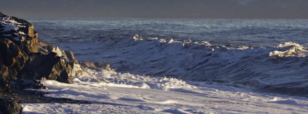
This picture was taken by Gary Williams, overlooking the Homer Spit in Homer, Alaska (December 5, 2011).  There are many elements found in this piece that inspire awe and emotions.  The dismal lighting brings familiarity to anyone who has had the esteemed privilege of visiting the Alaskan coast.  You can see how the diversity of the soft and harsh colors mingle with one another with blacks, whites and grays inviting the viewer to observe slants and balance in the photo.  The darker elements draw the viewer’s eye to where the water meets the land.  This allows the freedom for the observer to scan the entire composition of work.  The natural landscape provides texture to this piece by accentuating gray skies, deep crevasses and unsteady tides.  It affords the viewer the suggestion of movement in the tides, and rigidity in the clouds above the bay.  The contrasting feel of the snowy caps, and darkened waves are very visually stimulating. The shapes naturally formed in the picture are clearly defined. There is an organic line that that is present throughout this photograph. It follows the ridge line, to the water, to the lands end of the Spit.  I feel there is adequate and appropriate space employed to emphasize the sky, the land, and the sea. This provides harmony amongst the elements and genuinely kept me absorbed in my utopian affair.

I appreciate the artists ability to capture the simple beauty that Homer is, but in the same image, showcase how sovereign the landscape that encompasses the Spit truly is. My husband and I visit this spot in the fall every year.   The changing leaves throughout the state on the drive to Homer are as enchanting as the Spit itself. This picture prompts my senses to taste, feel, and smell the salt in the crisp air, welcoming us to a weekend of  bliss and peace.  I can  hear the crashing waves against the coastline, and know that we have arrived in our very own utopia.

Williams, Gary. “Home.” Gary Williams Photography– Salinas, CA –Landscapes, Portraiture, Events, http://www.garywilliamsphoto.com/.

Gary’s Blog